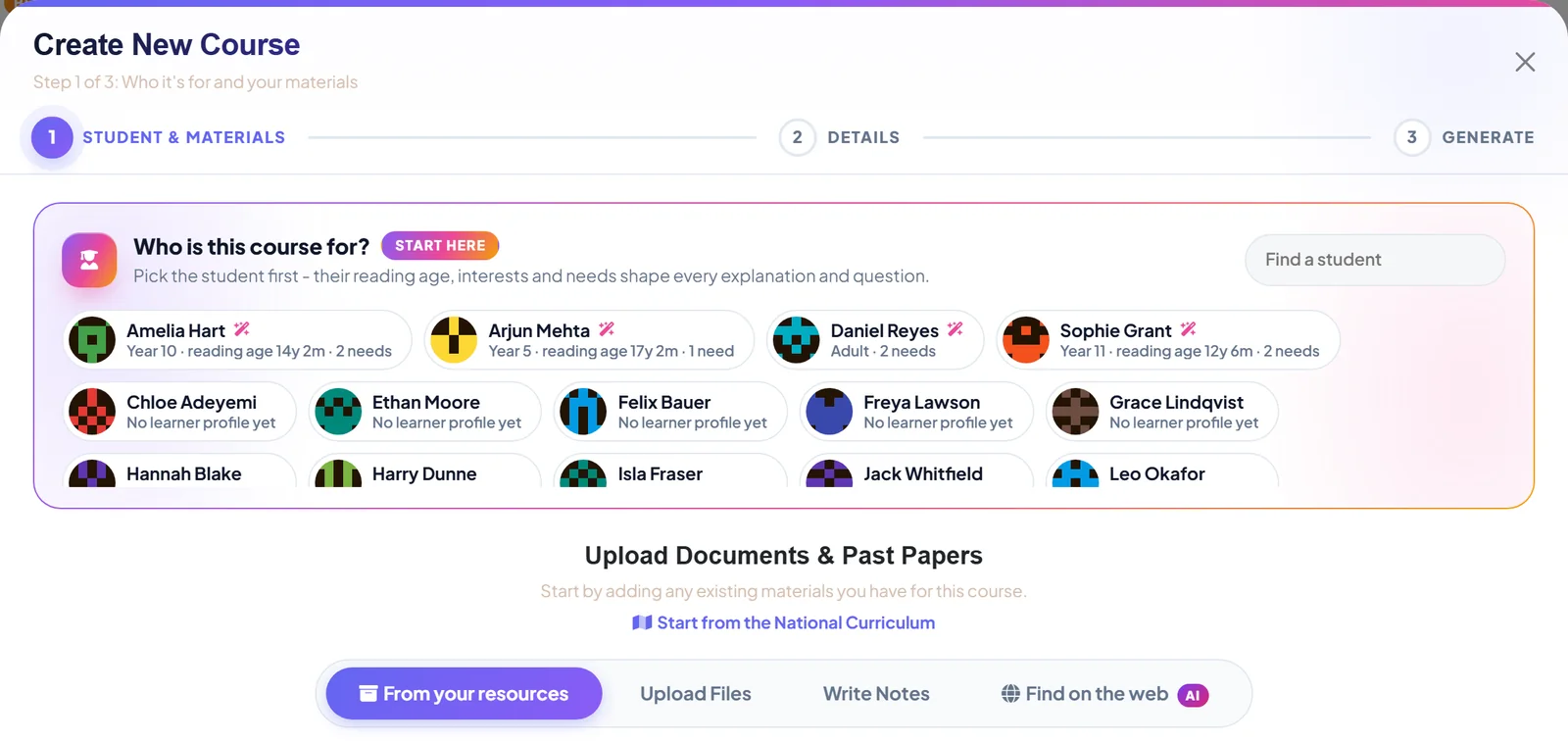
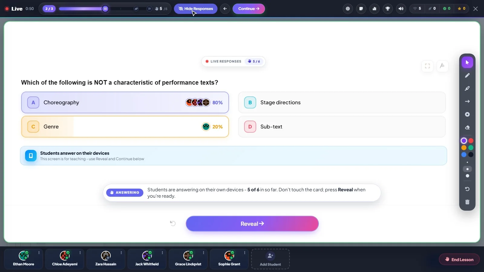
It is 6.40 on a Tuesday evening. Your first student arrives at 7. You open the laptop with a mug in one hand, and whatever appears on that screen has about five seconds to be useful.
Most software spends those five seconds showing off. Twelve tiles. A chart. A banner about a feature you did not ask for. A number in a red circle that turns out to mean nothing.
We wanted the Tutorio dashboard to do one job in that moment: tell you what to do next. So we drew it as a line.
Teaching already has an order
Ask any tutor to describe their job and it comes out as a sequence. You gather materials. You meet a student. You plan what to cover. You teach it. You find out what stuck. You change the plan. You tell the parents how it is going. Then you do it again, slightly better.
That sequence is the teaching line, and every class gets one:
- Resources. The specifications, past papers and notes you already own.
- Students. The people you teach, each with a profile.
- Courses. Lessons built from those resources.
- Classes. A group, the courses they are following, and the exam they are heading for.
- Deliver. The teaching itself, live or sent to students' own devices.
- Review. Finding out what stuck.
- Adjust. Changing the plan now you know.
- Report. Something to show for it.
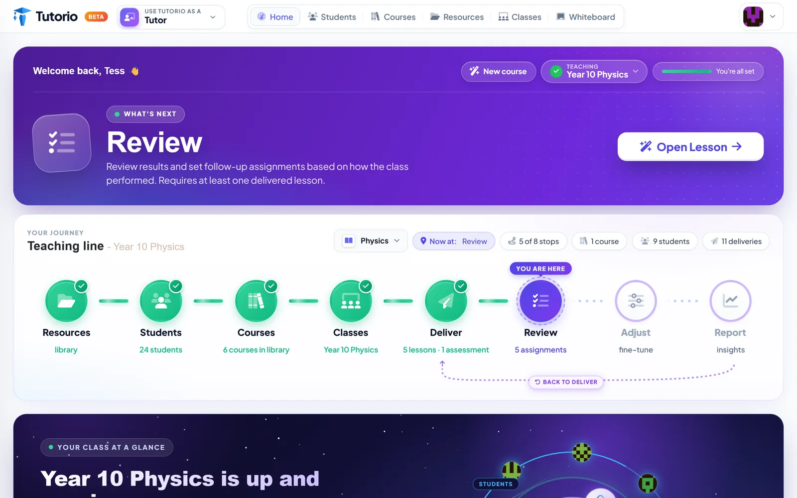
Finished stops go green and pick up a one-line receipt: 24 students, 6 courses in the library, 5 lessons and 1 assessment delivered. The stop you are standing on gets a ring and a little flag that says You are here, like a map in a shopping centre, except this one is right.
One card, one button
Above the line sits a card called What's next. It names the current stop, explains it in a sentence, and offers exactly one button.
In the screenshot, this class has been taught five lessons and nobody has yet checked what they remember. So the card says Review. Not "here are nine things you might consider". Just the next thing.
If you only have ten minutes before a session, the dashboard should already know how you ought to spend them.
We argued about this internally, for the record. A single suggestion feels bossy. But a tool that offers everything at once is really offering nothing, and tutors do not have the evenings to spare.
The honest bit: it loops
Look at the right-hand end of the line. A dotted arrow runs from Report back round to Deliver, labelled Back to deliver.
That arrow is the most truthful thing on the page. Teaching does not end at a report. The report is how you decide what next week looks like. Any tool that draws teaching as a straight line with a finish has never met a Year 10.
And then, a small solar system
Scroll down and the dashboard gets playful. Your class is drawn with its courses in the middle and its students in orbit. Tap a student and you land on their profile.
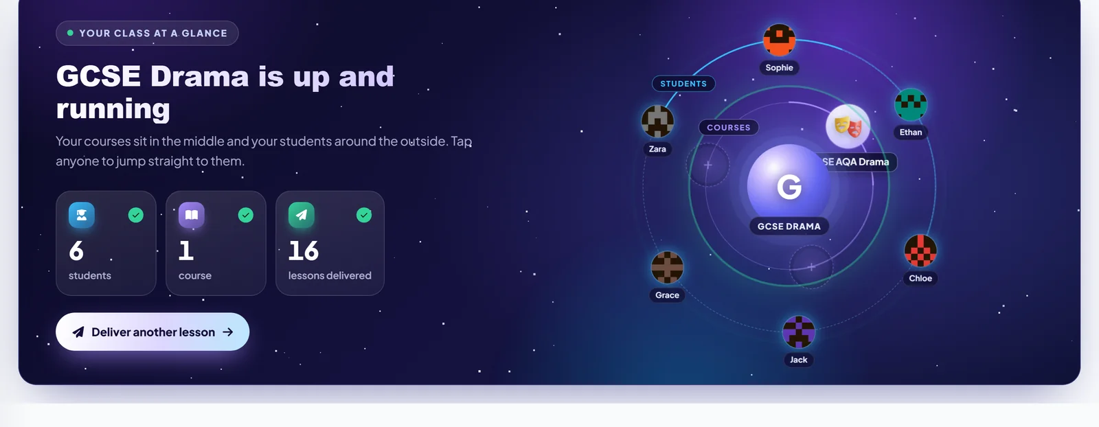
Is an orbit strictly necessary? No. But a class is a handful of people you know by name, and a table of rows never quite felt like them.
Where you will spend your time
The stop most tutors live on is Deliver, so it is the plainest screen we have. Your class's courses appear as a tree: course, topic, subtopic. Every row has a play button.
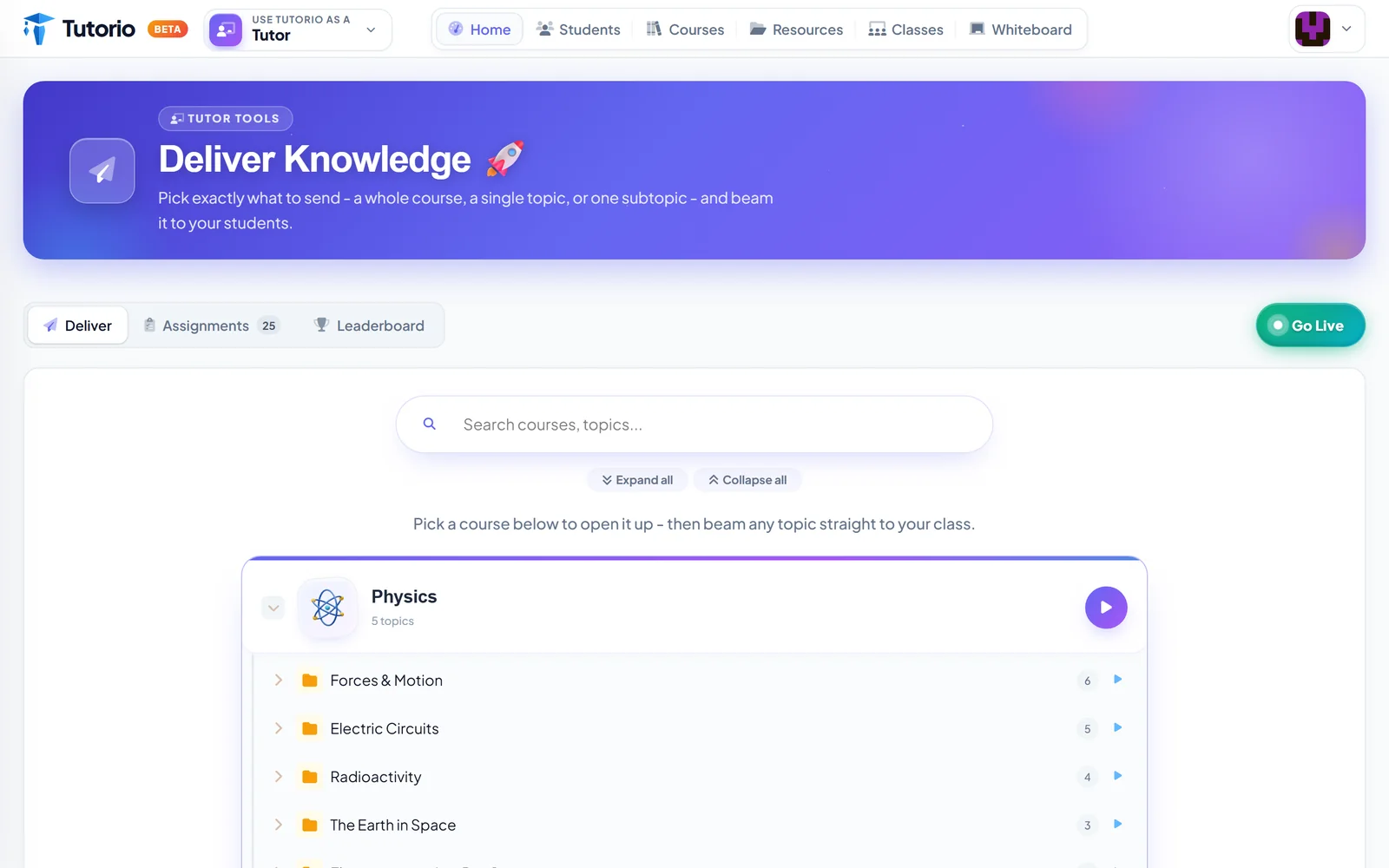
Press play on a row and that is what your students get. Press Go Live and the same content becomes a lesson the whole class follows on their own phones, which deserves a post of its own.
Why we built it this way
There are a lot of very good planning tools. You can colour-code a scheme of work until it looks like a tube map. Then Tuesday at 7pm arrives and the plan sits in one tab while the actual lesson happens somewhere else.
Tutorio is built around the lesson happening. The answers coming in. The next session being better because of what the last one showed you. A line that ends in a report and bends back to the teaching is that whole idea, drawn where you cannot miss it.

Questions people ask
What is the teaching line in Tutorio?
It is the order of a tutor's work, drawn as eight stops for each class: Resources, Students, Courses, Classes, Deliver, Review, Adjust and Report. Finished stops turn green with a one-line receipt, and the stop you are on is marked You are here.
How does the dashboard decide what I should do next?
It looks at where the class is on its teaching line. If five lessons have been delivered and nobody has yet checked what the class remembers, the What's next card says Review and gives you one button to start.
Can I send lessons to students without teaching live?
Yes. On the Deliver page, press play on a course, a topic or a single subtopic and students get it on their own devices. Go Live turns the same content into a lesson the whole class follows together.
Do I need a plan to use the tutor workspace?
Yes. The workspace needs a tutor plan: Solo, Pro or Studio. All three include the course builder, live lessons, classes and marking. Students never pay. The Help Centre explains how to choose a tutor plan.
Written by the Tutorio team. We build Tutorio, so these posts describe the product as it is today. Every screenshot is a real capture of the app, and anything that changes gets an updated date. Spotted something out of date? Tell us.